
2022
LE COPPER
Credentials:

I'm a paragraph. I'm connected to your collection through a dataset. To update me, go to the Data Manager. Click Preview to see my content. The Data Manager is where you store data to use in your site pages, or collect data from site visitors when they submit a form.
This collection in the Data Manager is already set up with some fields and content. To customize it with your own content, you can import a CSV file or simply edit the placeholder text. You can also add more fields which you can connect to other page elements so the content displays on your published site. Remember to sync the collection so your content is live! You can add as many new collections as you need to store or collect data.
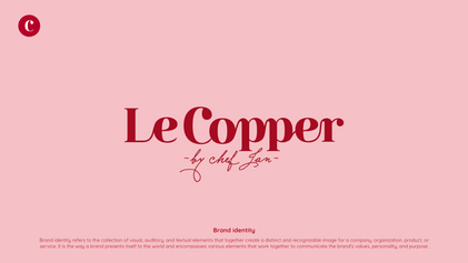
Le Copper is a unique and charming brand, with a deep connection to its owner, a small, cute woman who loves the color pink. When Farg Design Studio was tasked with the rebranding and packaging design, we drew inspiration directly from the owner’s personality to create a brand that reflects both her warmth and elegance.
The main concept behind Le Copper was to capture the charm and femininity of the owner while maintaining a sense of luxury and sophistication. The color pink was chosen as the primary palette to reflect the owner’s personal style, blending it with accents of copper, which gives the brand a touch of warmth and elegance. This combination creates a balance between playfulness and refinement.
The logo and packaging design were created to complement each other, with the intention of making the brand feel approachable yet premium. Soft curves and delicate details were used in the design to mirror the owner’s personality, while the overall aesthetic remains chic and stylish. The copper elements evoke a sense of high-quality craftsmanship, making the brand stand out in the market.
The Le Copper rebrand is a perfect reflection of the owner’s personality, combining charm, luxury, and playfulness. The new logo and packaging design help the brand communicate its elegant and feminine identity while appealing to customers who value quality and beauty. The visual identity created by Farg Design Studio positions Le Copper as a standout brand in its industry, with a strong connection to its owner’s vision.


